Turning millions of New York City taxi trips into interactive dashboards that surface travel patterns and demand.
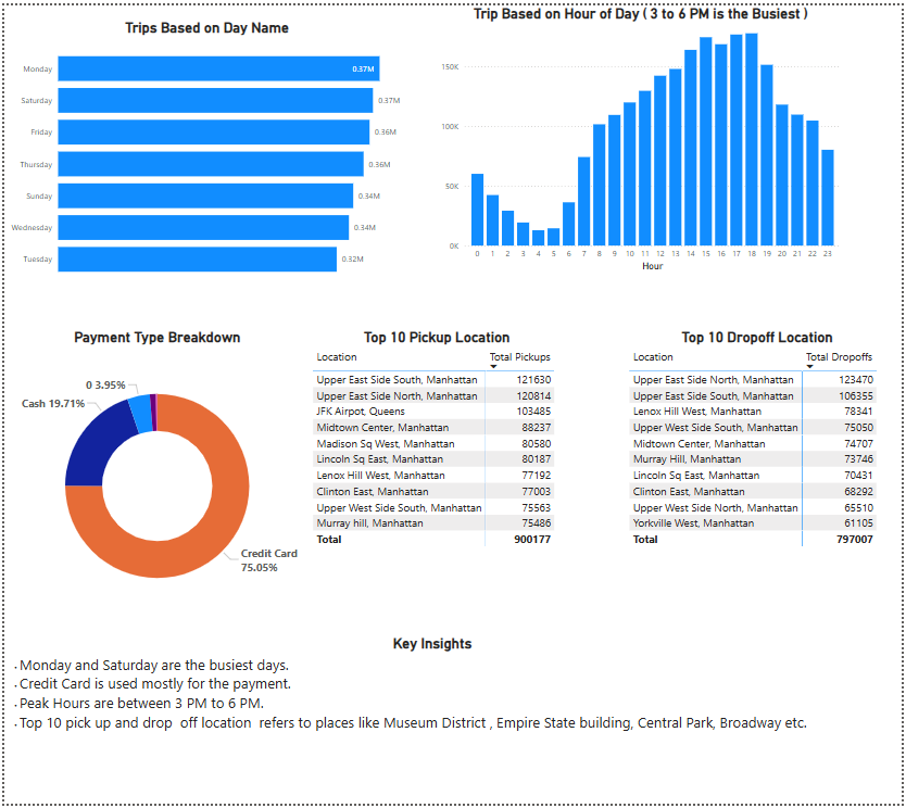
An end-to-end analytics project on the New York City yellow-cab trip dataset. Using Power BI and Tableau, it explores how the city moves — the busiest days and hours (demand peaks between 3 and 6 PM), how riders pay (roughly three-quarters by credit card), and the top pickup and drop-off neighbourhoods, which cluster around landmarks like the Museum District, Empire State Building, Central Park and Broadway.
Additional views break passenger counts down by borough — Brooklyn, Manhattan and Queens dominate — and track how average fares and trip volume trend across the year, turning raw trip records into clear, interactive insight.
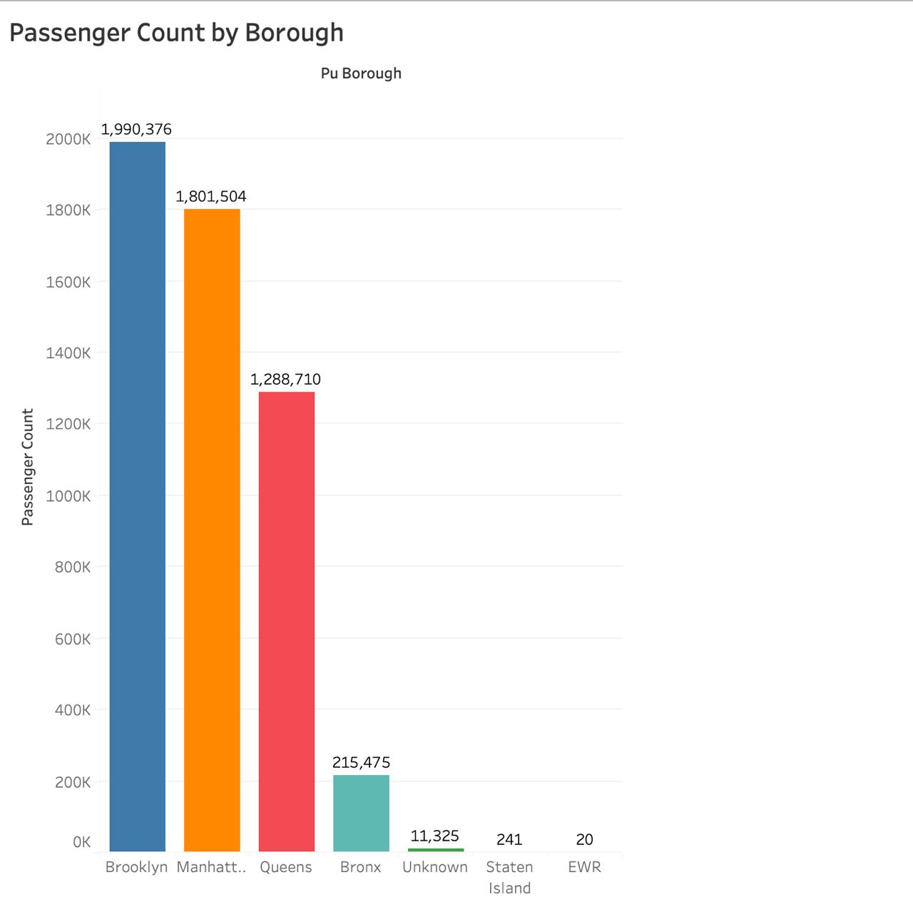
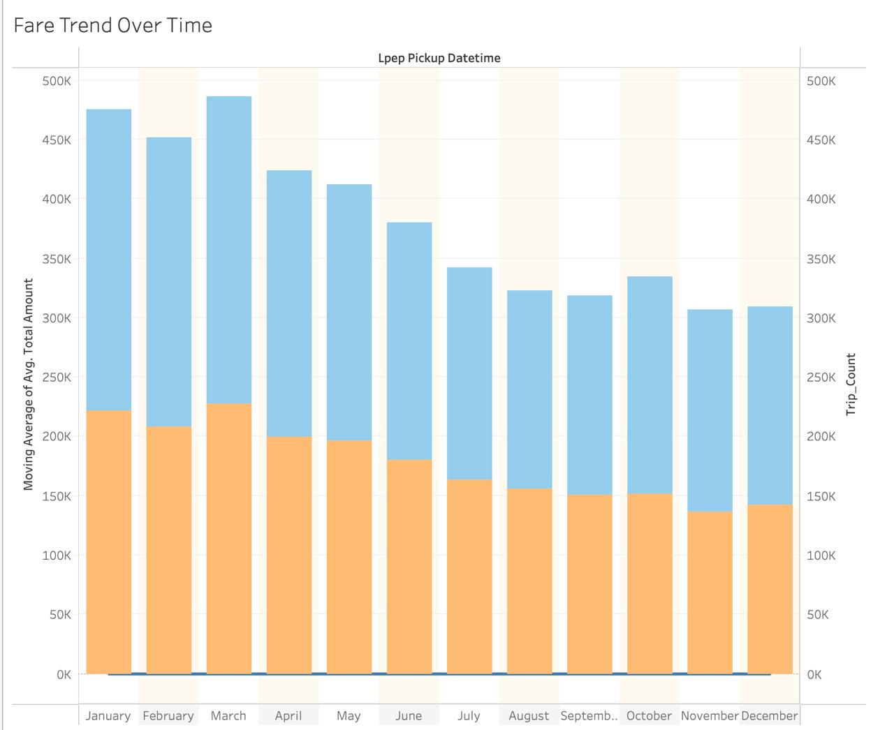
Interactive charts for boroughs and fare trends.
The main dashboard with slicers and KPIs.
Cleaning and preparing the raw trip data.
 binod
binod